When you think of Legos, the first thing that probably comes to your mind is how it is a pile of colorful bricks for kids. But there’s one thing that is just as iconic as the bricks themselves—the Legos logo.
The Legos logo is a simple, bold, and instantly recognizable logo design we have. And to be honest, it has remained a powerful symbol of creativity and fun for decades! Don’t believe us? Well, you have to continue reading until you do!
History of Legos Logo
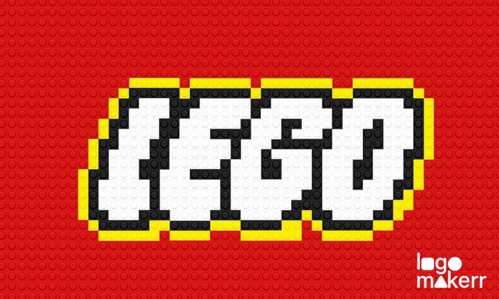
If you’ve ever stepped on a Legos brick (we all do) or you built something cool out of these blocks, then you’ve definitely seen the Legos logo. It’s a simple logo design in a red square with the world LEGO in white, bold letters, and are outlined in yellow.
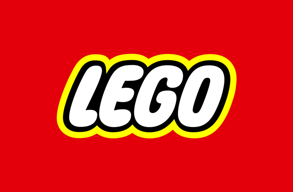
Yes, nothing too fancy.
But this Legos logo is incredibly effective and is actually recognizable instantly in that way for so many decades.
Still, just like any other logo designs out there, it has its own history. Legos logo wasn’t always this way. In fact, it’s gone through many changes since the company started in 1932. Yup, the company has been around for more than 90 years!
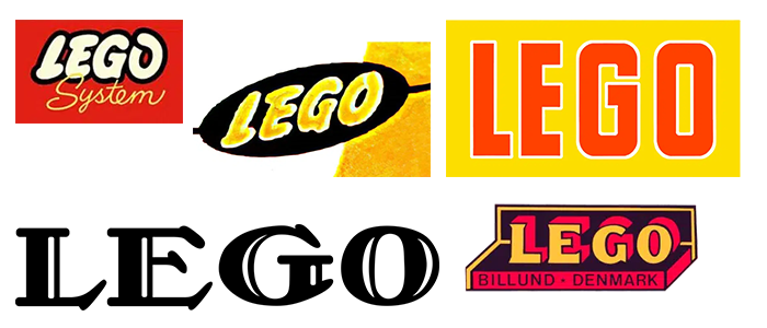
In the early days of the Legos logo, it was black and white, featuring more text than design – just like what you can see in the picture below.
Meanwhile, the now-familiar logo we all know only started appearing around the 1970s, and since then, it’s become one of the most recognizable logos in the world.
Why is the Legos logo so successful?
We know what you’re thinking: “Why does a toy company’s logo like Lego matter so much today?”.
Let us explain from an AI logo generator’s point of view – while secretly mentioning that our team here at Logomakerr.ai is an avid fan of this toy company.
The Legos logo is just timeless. It sticks to its core elements which are; simple shapes, bold colors, and just clear typography for instant recognition of its target market. These core elements are also the reason why the Logos logo is memorable to both kids and adults (there’s no denying in that).
Here’s a fun fact: A study found that 75% of kids worldwide could identify the Legos logo before they can even read. That’s how powerful it is.
So, if you are looking for a logo that’s as influential as this, using a free logo generator like our tool is probably your answer to having a clean, memorable, and recognizable logo for your personal brand or small business.
Legos Logo: Evolution
In 1934, Lego had a script-style logo that looked more like the company’s products belonged to a typewriter than a toy box. Sadly, it wasn’t until the 1950s that Lego decided to introduce color. And by 1973, the company also decided to include their now-famous shade of red for a logo design. Today, the logo has barely changed in almost 50 years!
Truly, this tells you something – if it works, don’t fix it. And trust us, as a Logomakerr.ai team, we see lots of people fixing their logos that didn’t need any more fixing (but commonly, it’s the other way around).
Will there be a future rebrand for Lego?
Lego is still crushing it. And to be honest, whether it’s through their traditional toy sets or collaborations with movies or TV shows in the entertainment industry, we don’t see any future rebrand for Legos logo. Mainly because their design works so much. In fact, 7 sets of Legos are sold every second around the world. That’s right, while you’ve been reading this, Lego has probably sold 200 sets already.
And of course, let’s not forget the role of Legos in the digital world. There are Lego video games, apps, and even Augmented Reality experiences. Still, whenever you see that red square with the white letters, you know exactly what you are getting: quality, creativity, and, of course, hours of stepping on bricks. (Seriously, be careful with those things.)
Create a logo like Legos!
Here’s how you can create a logo using Logomakerr.ai for your toy company like Legos!
- Go to Logomakerr.ai and enter your brand name
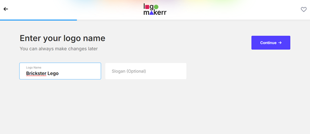
2. Select the perfect color scheme and font. With Logomakerr.ai, lots of Playful fonts for your toy company are available.
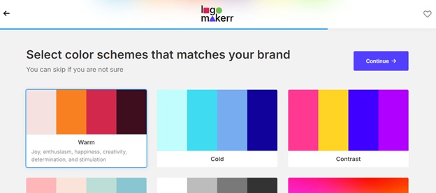
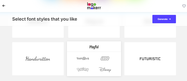
3. Click ‘Generate’ and adjust your logo according to your preference. You may also choose a symbol from thousands of choices!
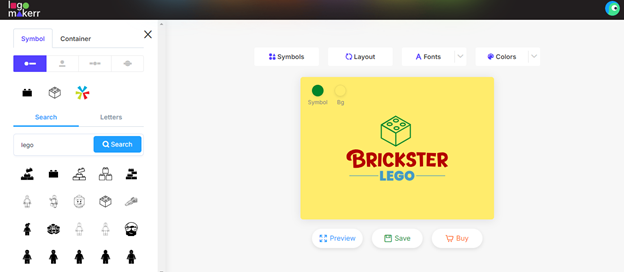
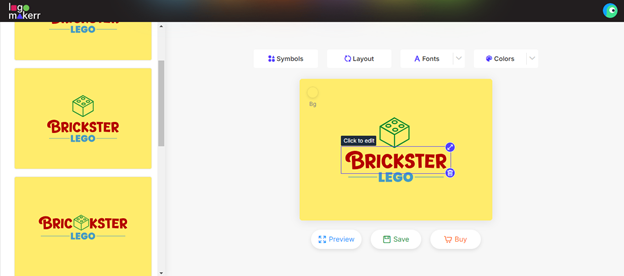
4. Save your logo or download it by paying as low as $29!
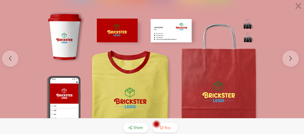
5. Of course, you can always download it for FREE by sharing it to your social media accounts and getting 20 likes on Facebook!
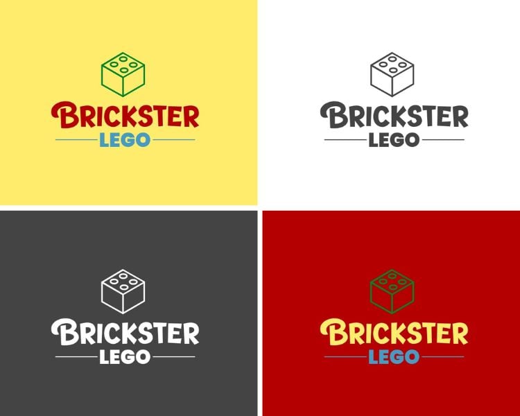
And that’s a wrap to our logo analysis for Legos logo. Create one today and establish your brand as one of the top players in the toy industry!
最終的な感想
So there you have it: the story behind the Lego logo and why it works. It’s a lesson in simplicity, consistency, and timelessness. Whether you’re a toy company that’s been around for almost a century or a new startup, these principles can make your logo just as powerful.
