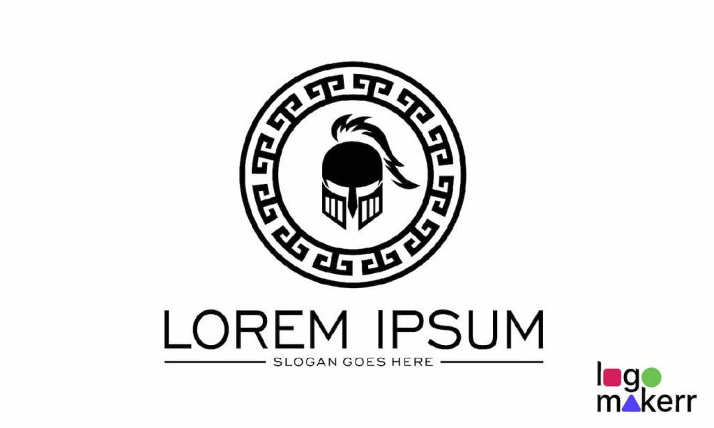
Designing a logo is giving your brand a visual tour to the internet. But when it comes to designing an ancient style logo, it’s definitely a whole different game.
With this logo category, you have to make it feel timeless, as if it could be found on an ancient scroll or like carved in a cave or temple or something.
If you are worried about not delivering the right ancient logo design, this blog post will teach you how to make it work.

So grab your chisel (or, you know, your computer mouse), and let’s get cracking on creating a logo that screams ancient history without looking outdated.
1. Pick the Right Symbols
Ancient cultures were big on symbols—things like Greek columns, Egyptian ankhs, and Roman laurel wreaths were more than just pretty designs; they had real meaning. So, the very first step to create an ancient style logo is pick the symbol that speaks to history.
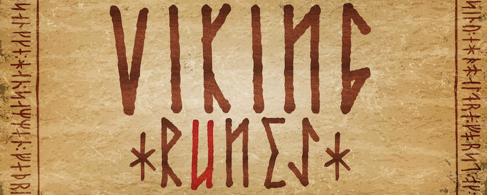
But hey, don’t go overboard. You don’t want your logo to look like an archaeologist’s laundry list of artifacts. Pick one or two symbols that really capture the essence of your brand.
For instance, if you’re going for a Roman Empire look, a sleek laurel wreath could be the star. Want an Egyptian flair? Maybe the eye of Horus is calling your name.
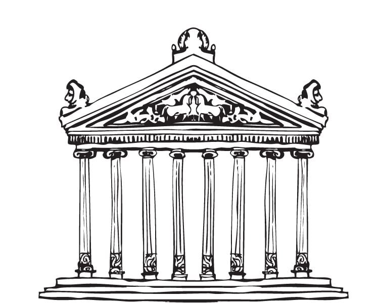
IMPORTANT TIP: We think that if your brand has nothing to do with ancient Rome or Egypt, don’t just slap a gladiator helmet for no reason. After all, ensuring that all symbols reflect your brand story will make this a success.
2. Go for Classic Fonts
For an ancient style logo, you need fonts that have stood the test of time—or at least look like they have. Think serif fonts with a little extra flair or fonts that mimic calligraphy or stone engravings. You may read this blog for simple logo fonts you can try out.
Fonts like Trajan, Garamond, or Cinzel can give off that ancient, classy vibe without being too hard to read. You can even customize the font by adding some texture to make it look like it’s been through a few centuries of wear and tear.
3. Color Palette for an ancient style logo
Color is key when you’re designing an ancient logo. You want shades that evoke the richness of history—think earthy tones, muted golds, rich browns, and stone grays. These colors give a sense of age and elegance without feeling dull. You can also use a splash or a little bit of royal purple or deep red for that ancient nobility.
You could even toss in a splash of royal But remember, we’re going for “timeless,” not “muddy.” Keep your color choices simple, and don’t overload the design with too many hues. A great ancient logo doesn’t need to be a rainbow—it needs to feel like it’s been around for a while and will still be around for centuries to come.
Read this blog to learn more about color psychology.
4. Textures and Patterns
Ancient logos can benefit from a little bit of texture. It’s totally obvious that artifacts weren’t smooth, they were carved in stone, woven into fabrics, or etched into metal. Adding a subtle texture to your logo can give it that same kind of timeless, handcrafted feel.

You could add a stone texture to your font to make it look like it’s been chiseled into a Roman monument or use a cracked parchment effect to give your logo the look of an ancient manuscript.
Pro Tip: Less is more when it comes to texture. You want it to look historical, not like your logo’s been through a natural disaster.
5. Balance Simplicity with Detail
Any ancient logo style (or rather, symbols) weren’t usually overly complicated.
They had a certain elegance in their simplicity, whether it was a single emblem or a clean, repeated pattern. Don’t overwhelm your design with too many elements. Keep the focus on your main symbol or wordmark, and let the details enhance, not clutter, your logo.

A little symmetry goes a long way too. Ancient cultures were big on balance and harmony, so make sure your logo feels well-proportioned and structured. Think about how the Parthenon or the Pyramids are built—perfectly balanced, perfectly iconic.
6. Look to the Past, but Don’t Get Stuck There
While we’re all about that ancient vibe, remember this: your logo still needs to work in today’s world. Your design should feel timeless, not out-of-date. So, while it’s great to draw inspiration from the past, be sure to give it a modern twist to keep it relevant.
This could be as simple as making sure the logo works across all platforms—whether it’s printed on a business card, featured on a website, or shrunk down for a social media profile picture. If it only looks good on a stone tablet, we’ve got a problem!
最終的な感想
Designing an ancient-style logo can be a fun way to bring a little history into your branding. It’s all about finding that balance between the old and the new. Pick the right symbols, fonts, and colors, and you’ll have a logo that looks like it could’ve stood tall in ancient Rome—and will stand the test of time today.
Try out Logomakerr.ai to create your very own Ancient logo style design for your brand!
To know more about this AI logo generator tool, watch this video before you get started.
