Logo design is more than just aesthetics; it can evoke emotions and create an experience. Good design is all about creating harmony and balance. There are advanced tools, such as an AI logo maker, that can help you further enhances the creative process, allowing for precision and innovation.
To help you with that, there’s this thing called the Gestalt theory – a psychological approach to understanding how people perceive and interpret images – especially logos for brands. It’s a concept that has existed for over a century and has left people in awe.

The principle ultimately states that people naturally see objects as a whole rather than their parts.
Moreover, Gestalt Principles help designers make order out of chaos and ensure that they convey every fundamental aspect of visual communication – all while not overloading the audience with too many things at once.
To help you understand better, let’s discover the Gestalt Principles of Design and how they can help to create a more memorable logo.
What are Gestalt principles and their relevance in design?
The Gestalt principles were developed in the 1920s by German psychologists Max Wertheimer, Kurt Koffka, and Wolfgang Kohler. These psychologists are known for their studies to understand how we gain meaningful perceptions from those surrounding us – full of chaos or not. Here are the Gestalt principles they are most known for:
- Figure-Ground: This principle explores the relationship between an object (the figure) and its background (the ground). By distinguishing between the foreground and background, designers can fashion a visual hierarchy and draw attention to specific elements.
- Similarity: The principle of similarity states that objects with similar visual attributes, like color, shape, or size, are perceived as belonging to the same group. Designers can use this principle to make visible unity and group related elements together.
- Proximity: The principle of proximity suggests that objects close to each other are perceived as being related. Designers can establish relationships and communicate connections between different design parts if they place elements nearby.
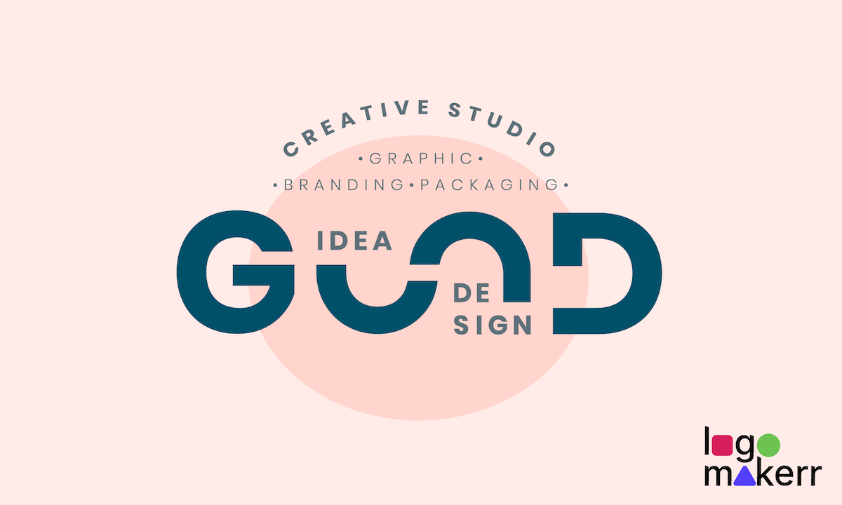
- Closure: Closure refers to the human tendency to complete incomplete shapes or patterns mentally. With this principle, designers can create intriguing designs that engage with the audience’s imagination.
- Continuity: The principle of continuity states that the human eye naturally follows smooth and continuous lines or curves. Designers can use this principle to guide the viewer’s eye and create a sense of flow and movement.
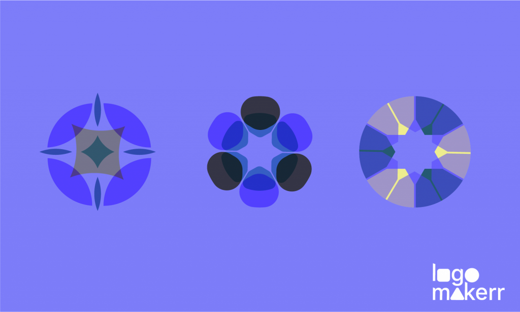
- Symmetry and Balance: These principles explore the human preference for visual order and balance. Symmetry refers to the equal distribution of optical elements, while ratio refers to a design’s overall stability and equilibrium. Designers can create visually pleasing and harmonious compositions by incorporating symmetry and balance.
As a designer, it’s essential to leverage Gestalt principles effectively to craft a design that catches the viewer’s eye and communicates messages clearly and on a deeper level.
If you are a beginner to design, know that Gestalt principles will allow you to go beyond mere aesthetics and amazingly tap into the psychology of visual perception.
Why use Gestalt principles for designing?
Imagine you’re putting together a jigsaw puzzle, but instead of using the picture on the box as a guide, you have to rely on your brain’s instincts to figure out what the complete picture should look like.

That’s what designing with Gestalt principles is all about. It can be the magic spell you need to brainstorm a design with complete patterns (or not) that stand out from the crowd and stick in people’s heads. After all, Gestalt principles are developed to elevate your design to new heights.
Applying the Gestalt principles in digital and print design
Though Gestalt principles were developed in the 1920s when digital and print design was not that popular, the regulations are relevant, especially today, where arts can significantly enhance the visual impact of a brand to its audience. But how do you apply Gestalt principles in digital and print design?
First, create a sense of cohesion and organization through the proximity principle. This can be done by grouping related content and images or placing related buttons and menus to ensure a user-friendly digital design for the audience.
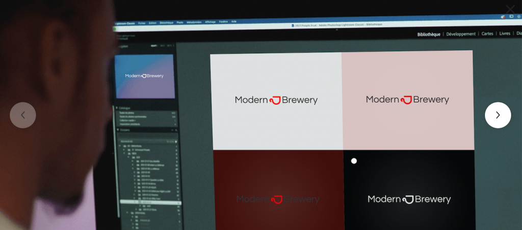
Second, similarity. At this point, use similar colors, shapes, or fonts to create a visual connection between the different elements of your design. Doing so will help users easily recognize your brand.
Another Gestalt principle to utilize is closure. Here, allow the audience to mentally complete the design by presenting incomplete or fragmented elements. Ultimately, this will create a sense of intrigue, an effective marketing method.
The principles of symmetry and asymmetry are where you convey a sense of balance and order or if you want the design to be energetic and dynamic. Depending on the requirement or the target message you want for your plan, you can apply either principle to achieve the desired effect.
Harness the power of Gestalt principles with this AI logo maker.
Logo designing incorporating Gestalt principles has always been challenging with an AI logo maker that you can use for free.
With Logomakerr.ai, you have access to a cutting-edge AI logo maker that can help you craft a striking and cohesive logo, all while conveying the psychology of visuals any Gestalt principle possesses.
Logomakerr.ai also offers many color scheme options, typography, and pre-made templates – no designing skills are required. Plus, the tool allows you to select the industry you’re in to ensure that it gets the correct type of logo that fits your brand.
Of course, you can continuously iterate, change background, symbols, and layout, and even choose from thousands of fonts available on Google Fonts–all in one place!
