An aesthetic logo mainly aims the company’s target audience, products & services, and overall image. It’s a lengthy process requiring a significant amount of time and effort to achieve the its beauty.
This is why, designers often ask themselves what makes an aesthetic logo different from any other type of logo. While there is no one answer to this question, there are certain elements that can make a logo more aesthetically appealing – especially if you’re opting for an AI logo maker.
In this blog post, we’ll look at some of the key features that sets aesthetics to other types of apart from the rest.
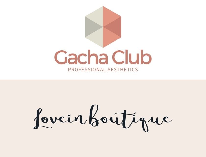
What is an Aesthetic logo?
An aesthetic logo has been designed with the sole purpose of looking good. I mean, who doesn’t exactly likes to look good?
It is often described as being visually appealing, stylish, and modern.
These designs are also usually for companies or brands targeting a younger, more fashion-conscious audience. The beauty of an aesthetic logo can be achieved using color, shape, typography, and other design elements.
But you might wonder, why some companies prefer an aesthetics among the other type of logo designs? Consider some of these advantages that makes them stand out:
- They can be more eye-catching and attention-grabbing.
- They can communicate a certain mood or feeling.
- They can make a brand more memorable.
- They can help a brand to stand out from its competitors.
So, if you are looking to create a logo or an icon for your business that will make a lasting impression, an aesthetic logo may be the right choice!
What makes an aesthetic logo different?
Aesthetic logo is often described as “simple yet sophisticated” and something that evokes positive feelings. They are usually simple, memorable, and timeless. All the kinds of logo designs that makes you want to look at it over and over again, just to try and figure out what it means.
Usually, an aesthetic logo will have some hidden message or meaning. But, a few things makes them different from a regular one.
First, aesthetics logo tend to be more abstract. They often use shapes and symbols that aren’t necessarily representative of what the company does. This can make them more difficult to understand at first glance, but it also makes them more interesting to look at.
Second, aesthetics logo often use colors in unexpected ways. They may use a limited color palette or use colors in unexpected combinations. This can help to create a unique look that stands out from the competition.
Third, aesthetics logo may use different fonts than traditional logos. They may also use different weights and sizes of fonts to create a more visually-appealing look.
Finally, aesthetics logo often have a hidden message or meaning. This can be anything from the company’s values to a more personal message. By including a hidden message, an aesthetic logo can be more memorable and meaningful.
Famous Collection of well-designed aesthetic logos:
- Apple: One of the most iconic and well-recognized logos globally, the Apple logo is a prime example of an aesthetic design. The simple shape of the apple, coupled with the sleek typography, creates a logo that is both stylish and easy to remember.

- Nike: Another iconic logo, the Nike swoosh, is an excellent example of the power of simplicity. The use of negative space to create the shape of the swoosh is both clever and visually appealing.

- Google: The Google logo is a prime example of repetition and hierarchy. The different colors are repeated throughout the logo, while the placement of the letters creates a clear order of information.

- Coca-Cola: The Coca-Cola logo is a great image for a balance and proportion logo designs. The use of symmetry makes a sense of balance, while the red and white colors are perfectly harmonious.

- Toyota: The Toyota logo is an excellent example of the use of color to create contrast and visual interest. The bright red color against the white background makes the logo stand out and be more memorable.

The ten different elements that make up an aesthetic logo:
- Overall Simplicity: Aesthetic logos are often designed with clean lines and a limited color palette, resulting in classy, attractive, and easy-to-remember aesthetics.
- Negative Space: Negative space is the space around and between the image’s subject. Negative space can produce an exciting and eye-catching shape and style in an aesthetic logo design.
- Repetition: By repeating specific design components, you may develop a logo that is both unified and appealing to the eye. This could include repeating shapes, colors, or patterns.
- Contrast: A logo with many light and dark colors will stand out and be more remembered. Too much variation, on the other hand, can be overwhelming and challenging to read.
- Balance: A well-balanced logo is attractive to the eye and seems harmonious. This is often achieved by using equal weight on either side of the centerline.
- Proportion: A logo’s many elements should proportion to one another. This results in an aesthetically appealing, easy-to-read, and understandable design.
- Hierarchy: A good logo will have a clear information hierarchy, with the most essential features taking up the most space and being the most visible. This aids the observer in immediately comprehending the logo’s message.
- Typography: Stylish and well-crafted typography can significantly impact logo design. The right font can convey the tone and message of a brand, which can gather and attract more prospects.
- Color: Color is one of the most important aspects of any logo. The appropriate colors can elicit specific emotions and establish a brand association. Colors can also be utilized to enhance visual interest and contrast.
- Mood: A logo’s overall perspective should be consistent with the brand’s identity. Whether joyous, nostalgic, or modern, a logo should make you feel something. When designing an aesthetic logo, keep these ten elements in mind to create a striking and memorable design!
最終的な感想
In a world where people are bombarded with advertisements and marketing messages in social media, digital marketing platforms, and other physical stores, it’s more important than ever to have a strong brand identity.
A well-designed logo is a critical part of that identity, and by incorporating these ten elements, you can create an aesthetic logo that is both stylish and memorable.
An aesthetic logo is often quite simple in design, with clean lines and a minimal color palette. This creates a sophisticated look that is both stylish and easy to remember.
Now that you know what an aesthetic logo is and some of the key features that make it stand out, you may wonder how to create one for your business.
The great news is, at Logo Maker AI, you can create a logo yourself! Yes, you can do it without having a design experience or a degree.
Just head on to our website, type your name and choose from our thousands of ready-made templates. Feel free to edit or customize your desired template, add a symbol that feels just right, and there you go!
Happy designing!


