In today’s digital world, a logo is more important than ever! And when it comes to creating a logo, there’s one design that reigns supreme — the letter mark or initial logo.
But what is an initial logo design? And why do they work so well for some businesses?
Here are a few reasons why you might want to consider designing an initial logo:
- Initial logos are unique and memorable.
- Initial logos are simple and easy to design.
- Initial logos can be easily scaled and modified to fit your needs.
- Initial logos can use across multiple platforms and media.
- Initial logos are versatile and adaptable to any industry.
One of the most common challenges people have when designing an initial logo is figuring out how to create a unique and memorable design.
Many business owners make mistakes using their company name in a standard typeface, which can be easily forgotten or overlooked.
So, in this article, we’ll explore everything you need to know about initial logos, including how to design one that accurately represents your brand.
We’ll also showcase some famous examples of initial logos that you can use for inspiration. So if you’re looking to create a unique and memorable logo, read on.
What is Initial Logo?
A initial logo is a type of logo that uses a company’s name or initials in a simple, typographic design.
These types of logos are often used by businesses that want a simple, elegant logo that is easy to remember and adaptable to any industry. They work well for companies that want to create a professional, polished image that can easily be scaled and modified to fit your needs.
How to Design and Customiza an Initial Logo?
When designing an initial or lettermark logo, it’s essential to consider your brand’s overall look and feel. What are your company’s colors and fonts? What is your brand’s style and tone? What are your core values and mission statement?
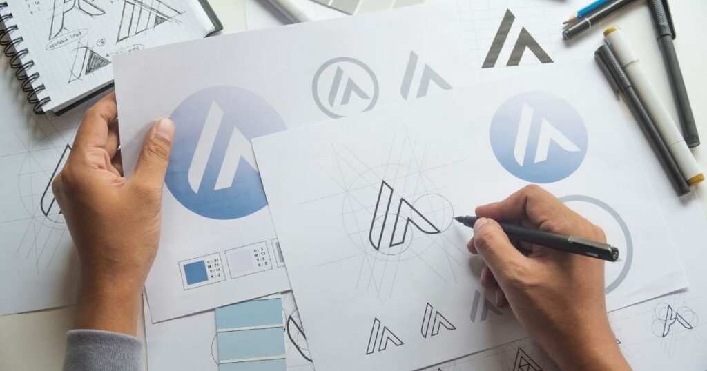
Consider all these elements when designing a letter mark logo. Think about how you want your logo to look and feel. Your initial logo should be an accurate reflection of your brand. Keep these things in mind when designing your logo, and you’ll be sure to create a design that accurately represents your company.
Think about your brand’s style and tone.
Your letter mark logo should be an accurate reflection of your brand. Consider your company’s style and tone when designing your logo. Do you want your logo to be playful or serious? Modern or traditional? Bold or understated?
Keep this in mind when designing your logo, and you’ll be sure to create a design that accurately represents your company.
Know your fonts and colors
When designing a letter mark logo, it’s essential to consider your brand’s colors and fonts. Your logo should be an accurate reflection of your brand’s style and tone.
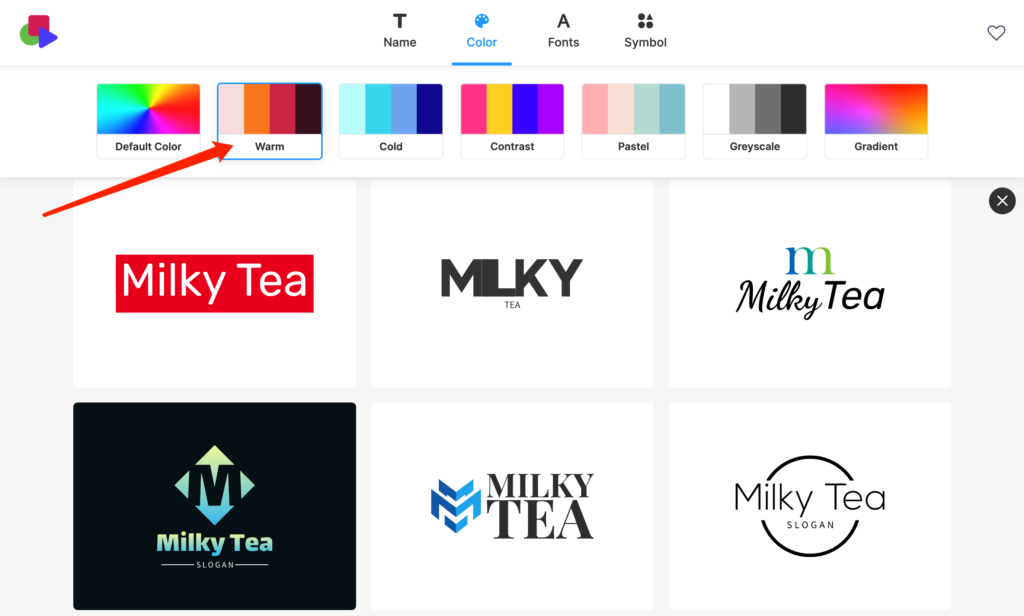
Think about the colors and fonts you want to use in your logo, and make sure they match your brand’s overall look and feel.
Create a unique and memorable design
One of the most common challenges people have when designing a letter mark logo is figuring out how to create a unique and memorable design.
Many business owners make the mistake of simply using their company name in a standard typeface, which can be easily forgotten or overlooked.
Try using a custom typeface or adding an icon to your design to create a unique and memorable logo. A unique and memorable logo will help your brand stand out from the competition and attract attention.
Consider your core values and mission statement.
Your initial logo should reflect your brand’s core values and mission statement. What are your company’s core values? What is your mission statement? It will be easier for you to communicate your brand’s core values through your logo if you are aware of them.
Benefits of Using Initial Logos
There are several types of logo design, but why should you choose a letter mark over the others? Consider some of the benefits of using one for your brand:
- Easily scalable and adaptable. One of the great things about initial logo design is that they are easily scalable and adaptable. They can be easily scaled up or down to fit your needs and can be adapted to any industry.
- Great for businesses with professional image. A letter mark logo is a great option if you want to create a professional, polished image for your business. Lettermark logos are often more sophisticated and classy than other types of logos.
- Memorable and easy-to-remember. Lettermark logos are both memorable and easy to remember. They tend to be straightforward, which makes them easy for people to remember. And because they are unique, they can help your brand stand out from the competition.
Examples of Popular Initial Logo For Inspiration
With hundreds of thousands of brands out there, you might never notice these popular brands and companies that use letter mark logos. Here are some of the brands you be inspired from:
HBO
HBO is the perfect illustration of an initial or letter mark logo, which has recently changed slightly in recent years. The phrase “Home Box Office” is no longer present in the most recent logo. The letter “B” is no longer blocked by the “O,” as it was in the previous version of the logo.
Chanel
The Chanel logo is one of the most recognizable fashion letter mark logos. This upscale French fashion label is well-known worldwide for its “haute couture” clothing, fine jewelry, scents, and other accessories.
It’s made up of two interlocked “C” s facing each other and bearing the owner’s initials.
Cartoon Network
Cartoon Network is a popular American media company for children founded in 1992.
The company’s logo has undergone numerous changes. In 2010, the channel once more redesigned it with the initials of the name “Cartoon Network” in a bold, monochrome font while keeping it short, simple and sweet – making it easier to distinguish and remember.
Louis Vuitton
Louis Vuitton is a high-end French fashion house founded in 1854. The company’s logo is one of the world’s most well-known and easily recognizable logos, and it consists of the interlocking initials “LV” set against a simple background.
KFC
KFC’s logo is one of the most iconic and recognizable logos in the world. The logo consists of ” KFC ” letters set against a red background.
The trapezoid in the logo gives it the appearance of a glass, which is one of the primary components of the fast-food chain and evokes feelings of warmth and hospitality.
LG
LG is a popular South Korean electronics company founded in 1947. The company’s logo consists of the letters “L” and “G” set against a red color background.
The initial logo represents LG’s efforts to maintain close ties with all their clients worldwide, creating an circled-shape emblem.
H&M
The company’s distinctive red logo is instantly recognizable worldwide as a symbol of affordable, fashionable clothing.
The company was initially known as “Hennes,” which is Swedish for “Her,” and changed to Hennes & Mauritz following a merger with a menswear company.
eBay
According to its designers, the eBay logo’s goal was to evoke a feeling of fun, freedom, and connectedness. Building a sense of community was made more accessible by the tightly coupled letters in the most recent symbol and the overlap in the last icon.
Go simpler for the better!
As you can see, many popular letter mark logos can be used for inspiration when designing your logo.
Remember to keep your design elements simple, memorable, and easy to remember. And most importantly, make sure it accurately represents your brand. With these tips in mind, you’ll be well on designing a successful initial logo for your business.
When you make an initial logo with Logo Makerr AI, you get free access to the editor studio, where you can create and tweak your custom logo.
Simply type in your brand name and let our innovative AI do the work for you! Browse and customize your logo colors, font, and symbols – you name it! You can tons of logo templates or illustrations, and download them in different logo files to get the best of your custom logo.


