Great, you already have a branding visual and logo design prepared for your business! But as a startup or small business just starting up, you should consider different brand attributes and find a way to present them well. Otherwise, you might not be on the same page as your design team.
Designers and creatives often use mood boards to help them visualize a project’s overall look and feel. And with the new kid on the block – Stylescapes, getting the overall visual aesthetic of your brand identity is easier than ever.
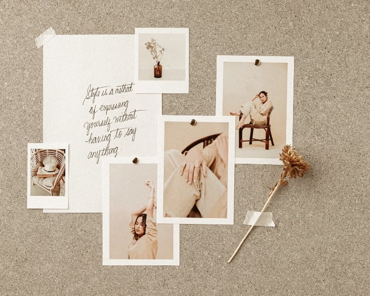
Stylescapes take Moodboards to the next level by exploring the finer details of a project’s design elements. It allows designers to understand brand identity and how to bring that identity to life. In this blog, let’s look at Stylescapes and how this tool differs from Moodboards!
What is Stylescapes?
Stylescapes is basically an opportunity for every designer to demonstrate a design project to a client, which makes it easier for everyone to brainstorm and comprehend the images, textures, typography, and colors needed to craft a brand’s perfect aesthetic.
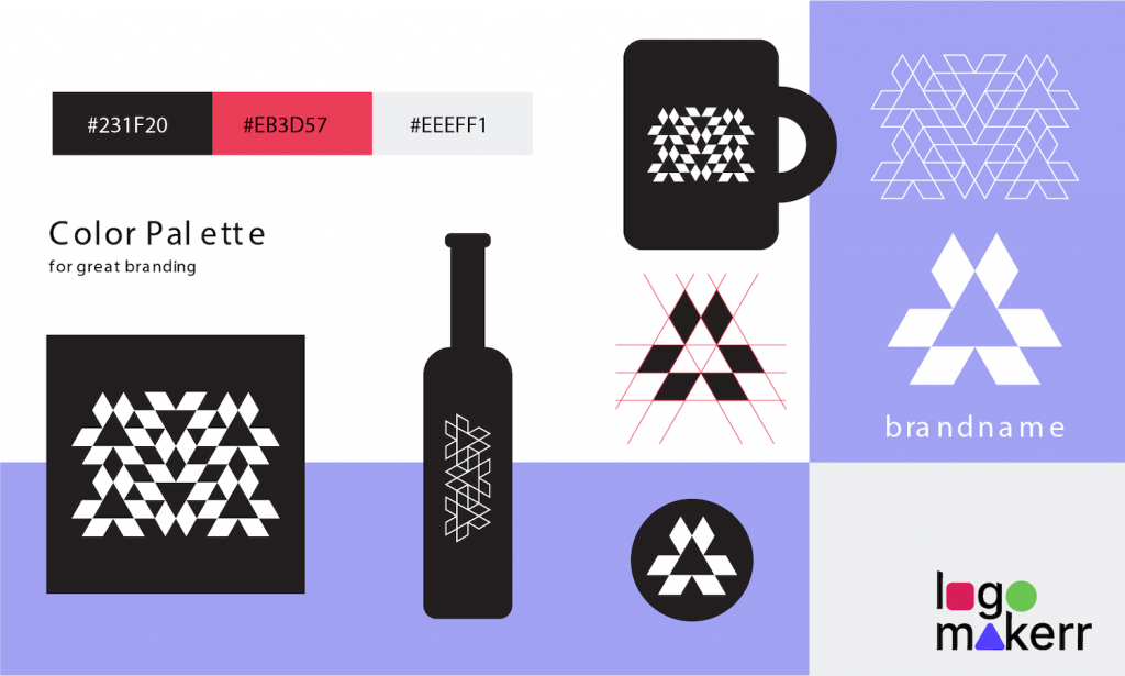
The image below is an example of a stylescape.
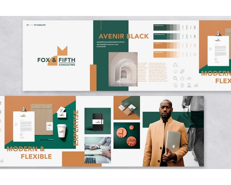
The primary purpose of stylescapes is for the client to feel and get a glimpse of their brand assets before they are even available to the public. So technically, stylescapes help create a visual roadmap for projects, just like you would make a visual identity for your target audience.
What sets Stylescapes apart from Moodboards?
Stylescapes and mood boards are valuable tools in the design process, but they serve different purposes and have a distinct brand strategy that sets them apart.
For instance, mood boards are known for the visual collages that capture the overall atmosphere and visual aesthetic of a project. On the other hand, stylescapes go beyond just visuals. It incorporates different design elements like typography, color schemes, textures, and even written descriptions to make sure that clients will convey a deeper understanding of the design direction.
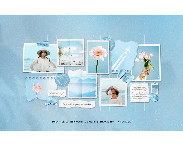
After all, it’s their brand’s personality, and the final stylescape design can make or break the point of the business.
Another thing that sets stylescapes apart from moodboards is it’s intentionally curated to reflect the specific story, messaging, and desired emotional response that the brand or design project aims to showcase. As a result, it fosters a more focused and efficient creative process.
What are the components of a Stylescape?
There are six primary components of a Stylescape. Each of these components needs to be carefully considered to define the visual direction of the design team.
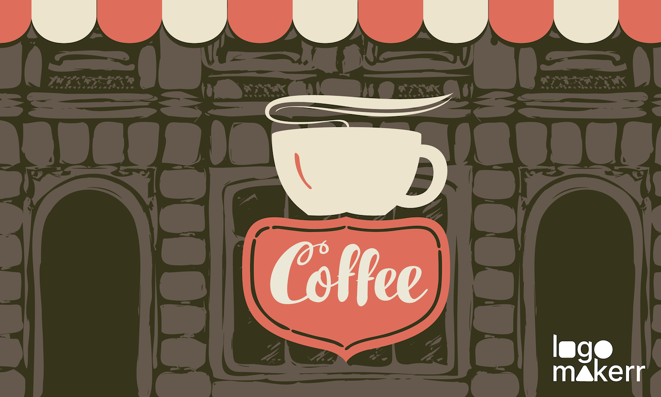
1. Imagery – Before you get into details, a Stylescape is full of images and illustrations that represent the overall aesthetic of a brand. Photos are considered one of the fastest ways to communicate and capture the target market.
To look for images, start by looking for inspiration in photography, art, architecture, fashion, and other relevant fields.
2. Color palettes – A cohesive color palette can reflect the mood and atmosphere you want to create for a brand. For instance, Red and Yellow are colors that immediately represent a brand in the food industry – especially fast food restaurants.
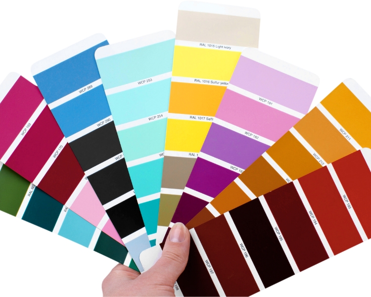
At this stage, you want to consider the psychological impact of different colors and how they can enhance your design concept.
3. Texture and patterns – If you want to add depth and character to the design project, taking a look at the many textures and patterns available is your best bet.
Whether you want it to be subtle or bold, experiment with different textures and patterns to craft an interesting visual interest in your design vision.
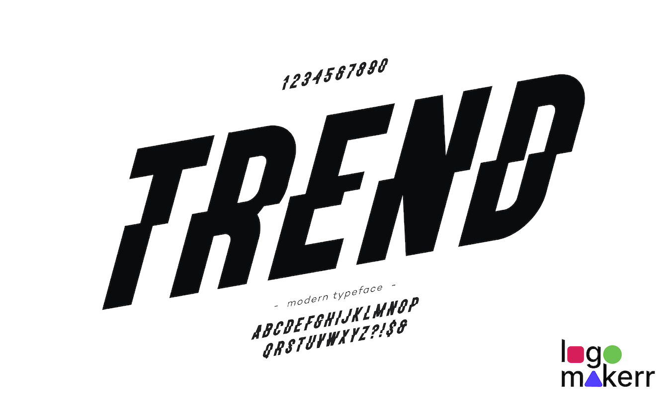
4. Typography – There are more than 200,000 fonts worldwide, and choosing one should complement the visual elements of your stylescape.
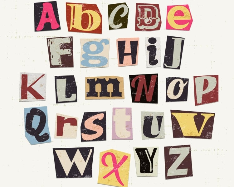
Remember, typography plays a crucial role in conveying the personality and tone of your design, so choose fonts that align with your brand and project objectives. It’s also important to consider the type of treatments, such as headlines, body text, etc.
5. Layout – Layout is another important component of a stylescape. Without it, the final stylescape design will look crowded and uneven.
Try to arrange the design elements by considering the hierarchy, balance, sense of order, consistency, and a beautiful visual flow. You can also use grids, symmetry, and other design principles that will help you guide your layout decisions.
6. Logo and other branding elements – Last but not least is the logo. While it may not be a fully finalized logo design, you can include a preliminary logo concept or ideas to show how they fit within the visual identity of the brand.
If you want to easily fashion a logo design, a free AI logo maker can prevent such expensive tasks and generate multiple professional-looking logo options.
Can you combine stylescapes and moodboards?
The answer to this question is an easy yes. With moodboards, you can have a visual brainstorming session with the design team, which serves as a starting point for discussions, ensuring that everyone involved is on the same page and has a shared understanding of the desired visual direction.
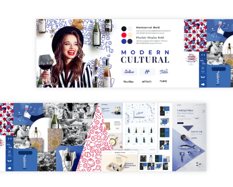
Partnering with stylescapes, you can get a more holistic approach to include the brand’s personality, target audience, and other design elements. Combining moodboards and stylescapes can yield remarkable results.
Use this free AI logo maker to finalize your Stylescape logo component.
Logomakerr.ai is a tool that allows you to efficiently and conveniently design a logo anytime without the need for extensive design skills or software. With this tool, you can design a unique and impactful logo for your stylescape – making it an ideal choice for many designers, whether they’re a beginner or not.
With just a few clicks, you can access a vast library of pre-designed templates, fonts, colors, and shapes to customize. You can iterate and adjust the logo design whenever the client requires it.
Fine-tune the logo component of your stylescape with Logomakerr.ai today!
