Facebook made a name as one of the most used social networking sites to date. It is also one of the most important social media platforms and is considered one of the web giants, along with Google, Apple, and Amazon.
Facebook achieved unbelievable results and is a success in the online community. Have you ever wondered about the origin of Facebook logo and how it affects its current status? This article is just about that!

The Beginning
Established last February 4, 2004, by Mark Zuckerberg, Eduardo Saverin, Dustin Moskowitz, and Chris Hughes, Facebook was originally a platform used by Harvard University students.
But due to its consistent demand from other universities, it became accessible to everyone by 2006. It became the social media standard until it gained billions of people’s visits daily.
Facebook is a very well-developed SNS that constantly improves from time to time, so many people trust this site.
People also earn while using this application, and it is a business helping many companies! Mark Zuckerberg created a convenient brand that benefits both users and investors!
Who created the Facebook Logo?
As Facebook penetrated the world’s success, Mark Zuckerberg and Sean Parker – one of Zuckerberg’s informal advisers when he built the website, requested Mike Buzzard of the Cuban Council to create a logo design for the company.
Buzzard’s design is very similar to what it is now and has only had minor changes over time.
According to one of Buzzard’s interviews, some major decisions during logo designs are the modification of font Klavika of Eric Jolson.
A good friend of his in the Cuban Council, Joe Kral, completed the changes and final wordmark used for the logo.

The Color of Choice on Facebook Logo Evolution
The blue color palette became the dominant color of choice for Facebook because Mark Zuckerberg suffers from a vision condition called deuteranopia.
Deuteranopia is a color blindness vision problem that gives difficulty to someone to distinguish between colors, but they can easily recognize blue.
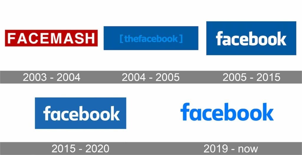
FACEMASH (2003)
Facebook first came out in 2003 under the name Facemash, and the logo was a website he made at Harvard University.
It had white capital letters on a maroon background. It was the original logo design and brand before it Reached the pinnacle of worldly success.
The Facebook Logo (2004)
When they revamped the website, the logo for Facemash looked strange. There were no spaces between the letters in the word “Facebook,” they wrote it in a light blue font on a dark blue background, and the logo also featured two angled brackets.
The Facebook Logo Modified (2005-2015)
It was 2005 when Facebook made a significant change in its logo design. They removed the Angle brackets and the word “the” from the design, and the blue font changed to white.
These changes made the logo look simple, cleaner, and legible, which took ten years when they used this logo design.
The Facebook Logo Modernized (2015-2020)
It seems undetectable at first glance, but in 2015, Facebook made minor changes to the logo. The letter “a” and “b” were both transformed. They also introduced the different colors of the blue version, but the “f,” b,” and “k” letters’ sizes remained the same.
Facebook (2019-2021)
They changed the iconic blue background to white last 2019, and the wordmark used a medium blue palette on a white background. The redesigned logo became a hit for users who had never seen significant changes in the design for several years.
Meta (2021-Now)
The parent company of Facebook changed its name from Facebook Inc. to Meta Platforms Inc last October 2021. The move to change the term focuses on building a metaverse, an integrated environment that links the company’s products and services.
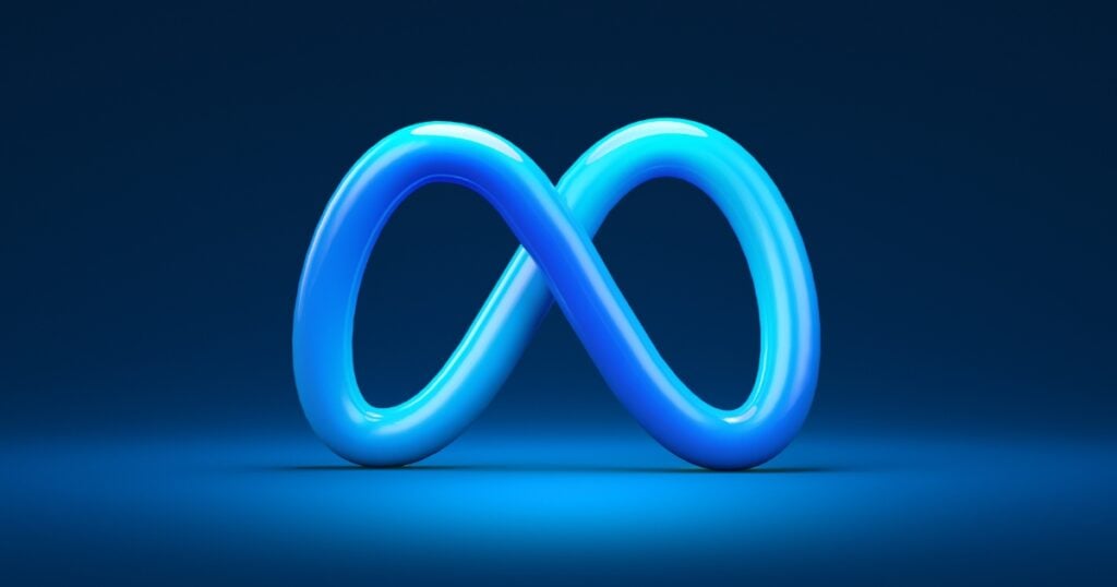
They then introduced the Meta logo, featuring an infinity loop logo that looks like the letter “M.” The new Meta design was modern and trendy, and the change showed a simplistic appeal yet a very innovative design.
Facebook Logo Icons
Like the logo, Facebook icons also change several times with each redesign making it more straightforward and minimalist. The first Facebook icon was the most intricate one.
The hero was a classic lowercase letter “f” with a slight shadow at the back, and it was in a light blue frame. But from 2009 to 2013, they changed the icon into a light blue line at the bottom of the hero. It was 2013 when they removed the icon’s border. The shape of the picture was like the letter “f.”
The first significant change in the icon was released last 2019. The background is now round instead of square. The symbol is perfect for social media icons for business cards.
Throughout its evolution, Facebook chose a simple design that paved the way for the effectiveness of its brand to users. Facebook does not occasionally change its logo to attract users to use its site.
All designs featured through the years were never flashy logos, which proves that people never need a too-overwhelming design! A simple yet unchanging logo design– can conquer the world market.
Facebook logo plays a vital role in representing its brand’s image and has an impressive and remarkable evolution and history. Recreating the look of the Facebook logo is not difficult at all. In any case, you may get a head start on making them by using our completely ready and free templates below.
Logomakerr.ai is an automated and efficient ai logo generator that can create brand identities, on-brand social postings, and your company’s Logo. Let’s get started on creating your amazing logo right now with Logomakerr!
